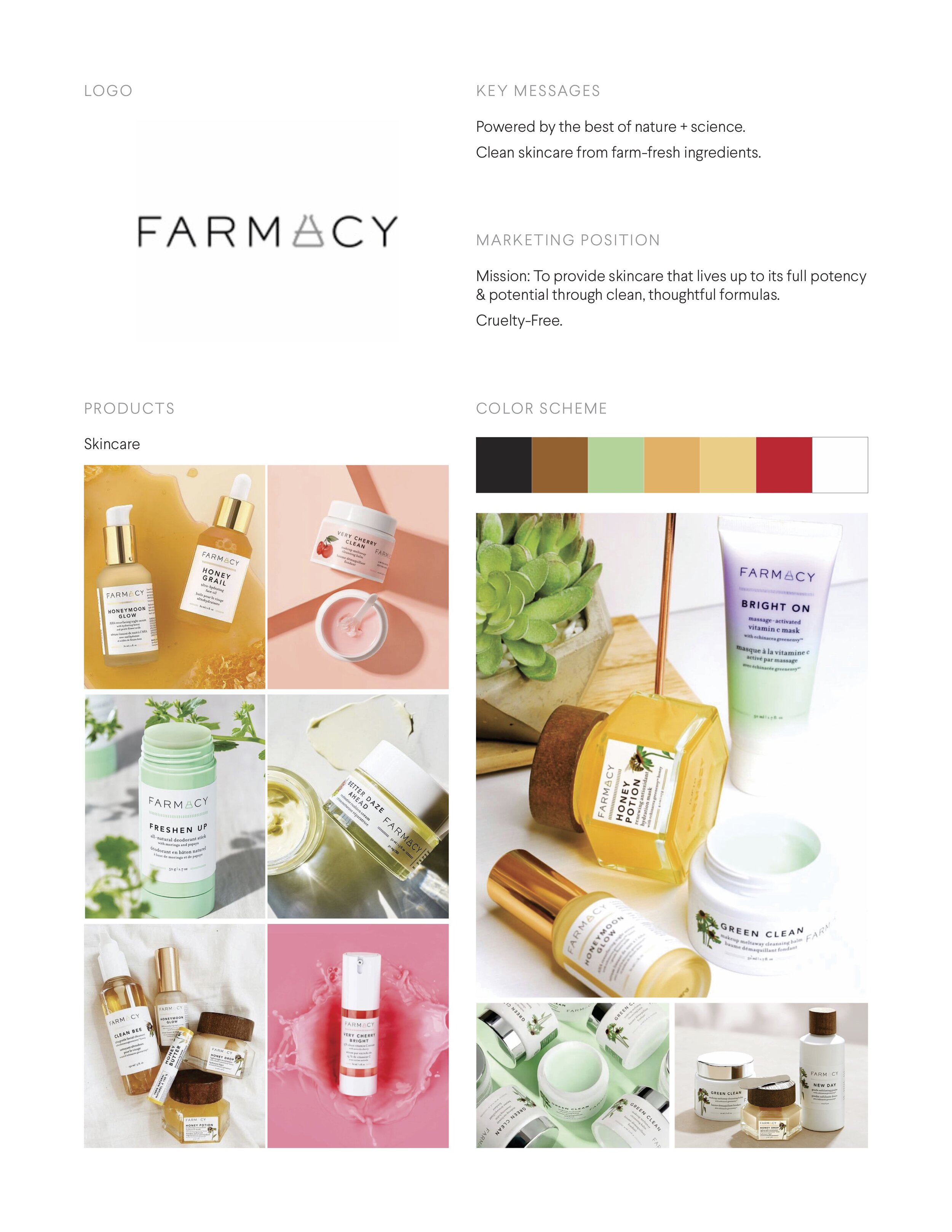


competitive audit
+ made competitive audits for 5 different skincare brands
+ created a creative brief based on audits & research


ideation
+ made 3 mood boards for 3 different design directions
+ design direction #1
> natural, earthy color scheme
> hand drawn, artistic plant illustrations
> ingredient exploration
+ design direction #2
> bright, colorful color scheme
> inspired by European bazaars & markets
> texture exploration
+ design direction #3
> organic color scheme
> inspired by farmer’s markets
> homemade/handmade exploration
design exploration
+ began brainstorming & sketching ideas
+ received feedback for the most interesting ideas


logo iterations
+ identified sketches with the most potential & created logos digitally
+ narrowed down selections to three potential logos
+ created initial mockups to demonstrate logo application
INITIAL MOCK UPS
+ colors were too bright
+ incorporating real roses was challenging
+ some mock ups look more realistic than others
KEY TAKEAWAYS
— Fresh Beauty was created from a place of love for travel & culture
— Hand drawn elements feel more relatable and genuine
— Engaging with the senses is challenging and liberating
CONSIDERATIONS FOR IMPROVEMENTS
— Incorporate more illustrative texture elements
— Explore what branding would look like for animations & videos
— Consider concepts for different ingredients for photography


